Choose the country or territory you are in to see local content.

English

en

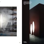
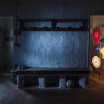
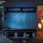
Dopo l’interpretazione del luminator che ha dato vita a Chiaroscura, Alberto e Francesco Meda tornano a reinterpretare un classico della luce per Foscarini, lo chandelier.

Dopo l’interpretazione della storica Luminator disegnata da Pietro Chiesa nel 1933, che ha dato vita a Chiaroscura, Alberto e Francesco Meda tornano a reinterpretare un classico della luce per Foscarini, lo chandelier. Lo fanno lavorando, ancora una volta, con estrusi di alluminio e integrando l’elemento luminoso all’interno del corpo stesso della lampada, concedendosi anche un divertissement decorativo ottenuto impeccabilmente grazie al gioco di incastri tra la fonte luminosa e il sostegno.

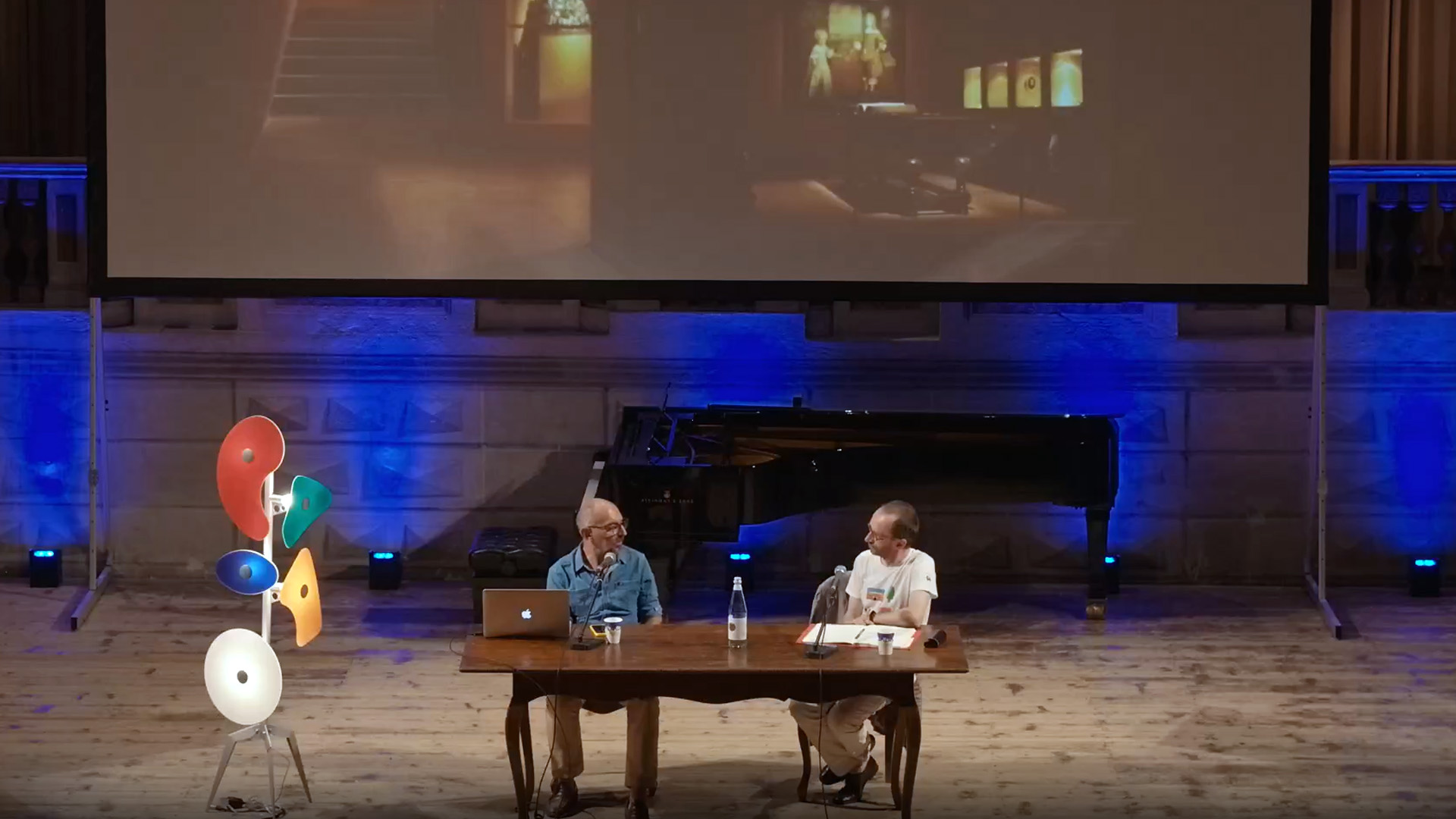
Perché, secondo voi, Foscarini vi ha chiesto di collaborare a questo progetto?

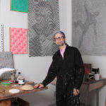
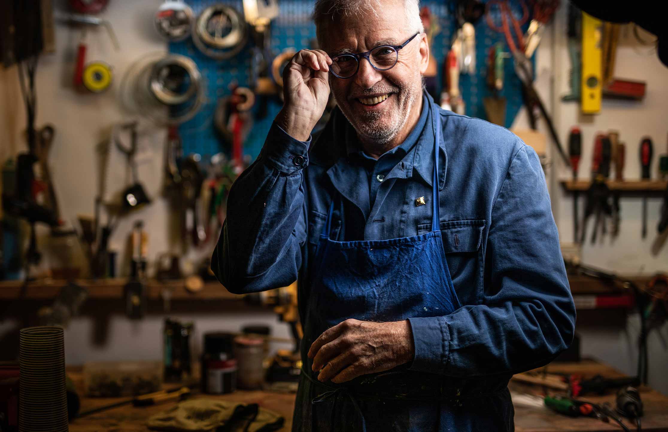
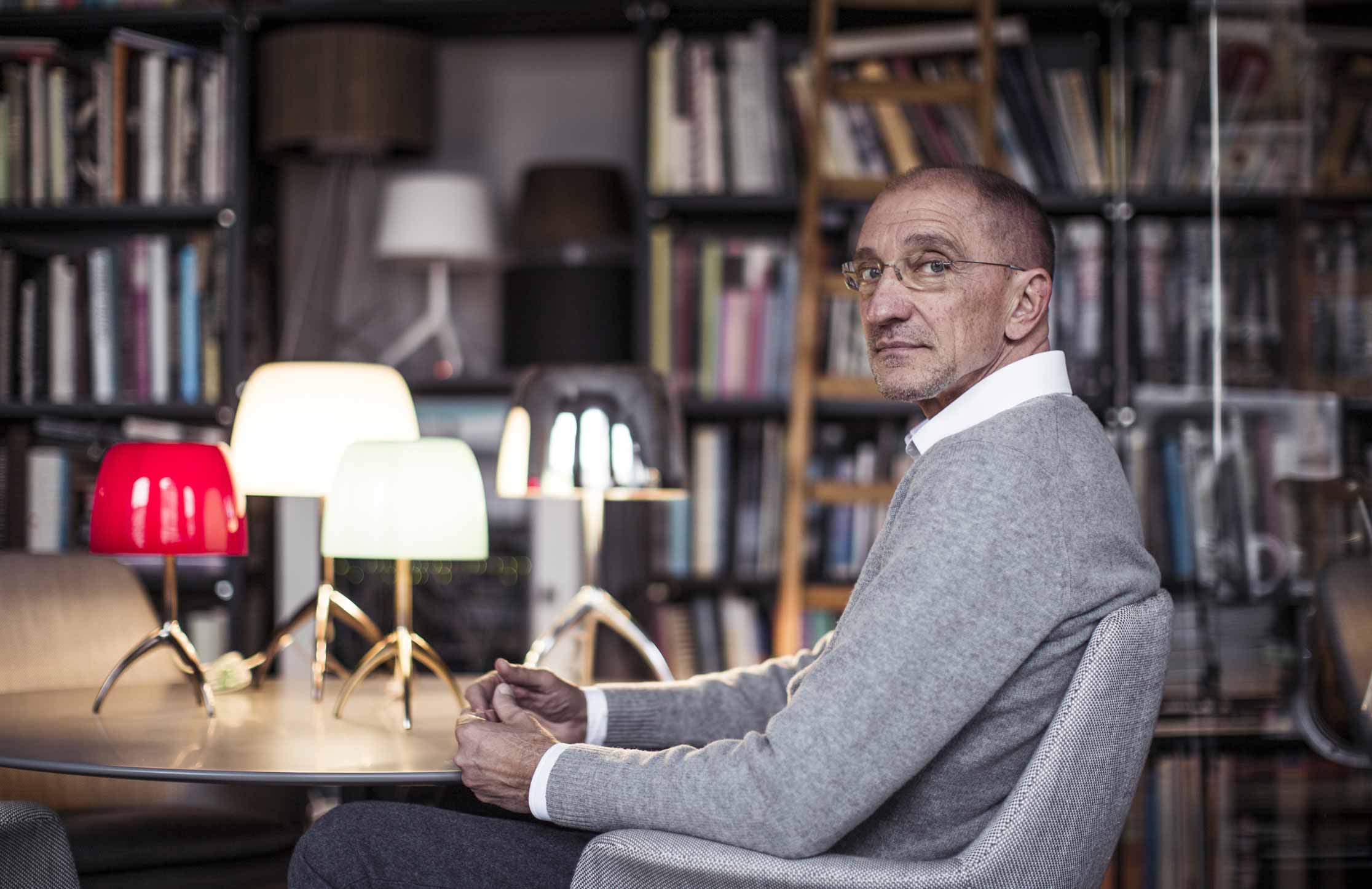
«Sicuramente Foscarini cercava una pluralità di mani e sguardi da impegnare sul tema della sperimentazione intorno al tema dello chandelier. Rispetto agli altri designer ingaggiati (Francesca Lanzavecchia e Dordoni Studio, ndr), la nostra forza penso sia insita nella ricerca di innovazione a partire dal dialogo tra materiali e tecnologie, interpretando in chiave contemporanea la tradizione senza stravolgerla nella sua essenza».


Da progettisti, qual era l’interesse in questo progetto?

«Ci piace lavorare su tipologie rimaste immutate nel tempo. Lo abbiamo fatto con Chiaroscura, e lo stesso vale per lo chandelier, un oggetto studiato e reinterpretato infinite volte, ma sempre con un approccio basato sul decoro e sulla molteplicità delle fonti luminose. Noi, invece, abbiamo scelto di affrontare la sfida da una prospettiva opposta».


Quale?

«Siamo partiti chiedendoci cioè dove ci avrebbe portati la tecnologia per l’illuminazione contemporanea, cioè i LED che offrono nuove opportunità che permettono di lavorare sulla qualità della luce e sulla sua distribuzione. Ci siamo chiesti, all’interno della tipologia del lampadario importante e centro stanza quale fosse la forma più essenziale che i LED permettevano di ottenere. Ne è uscita l’idea del braccio, con una striscia di LED, che è stato il punto di partenza del progetto».

Qual è la chiave di lettura per cogliere la portata innovativa di ASTERIA?

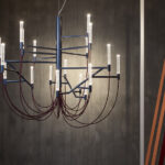
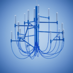
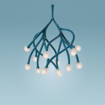
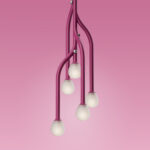
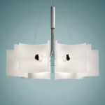
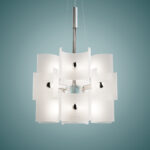
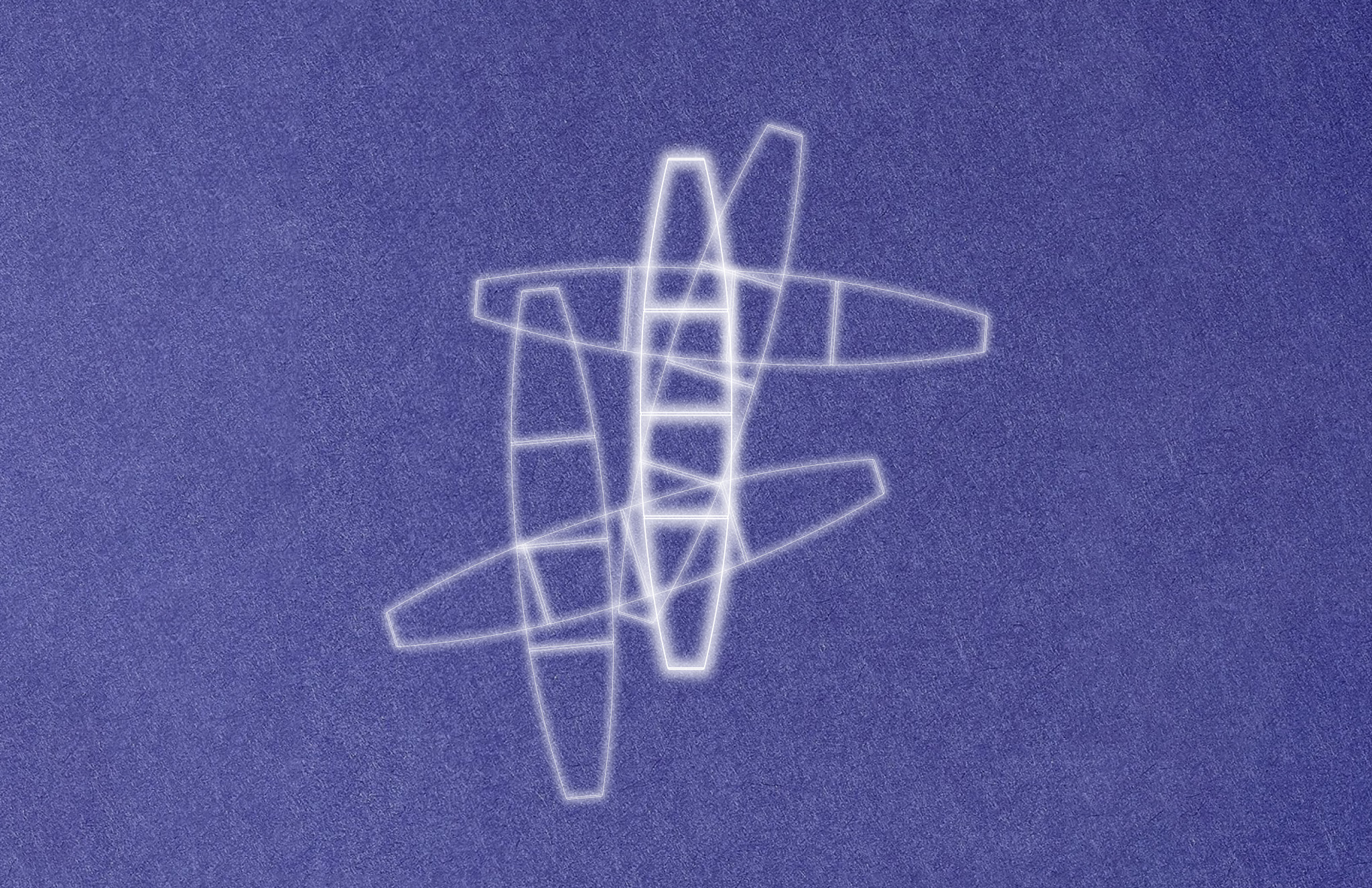
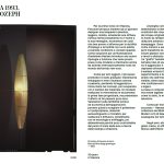
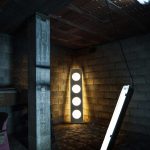
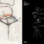
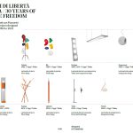
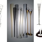
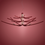
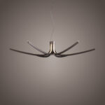
«La forza progettuale di ASTERIA sta nell’integrazione intima tra struttura e luce.
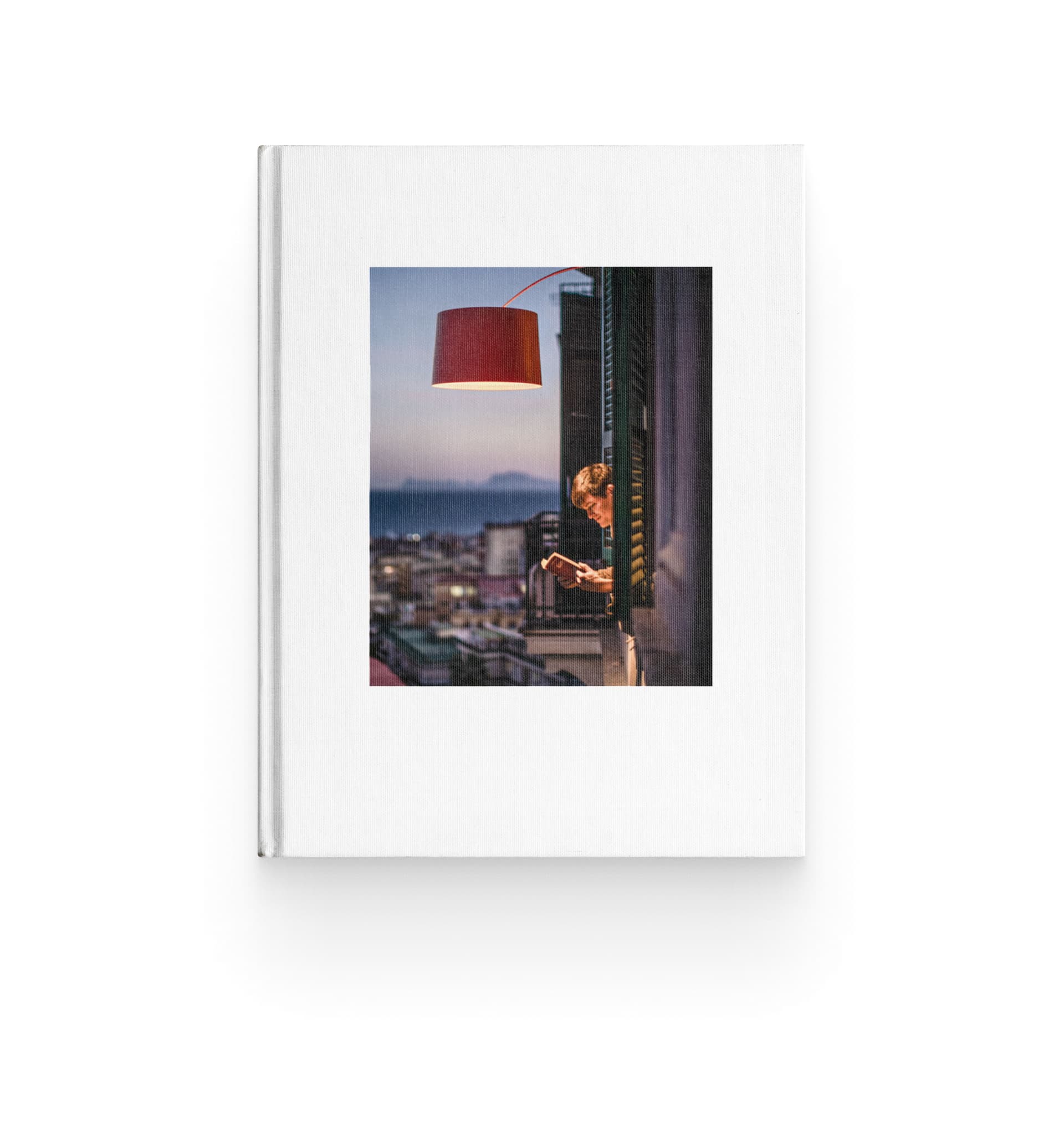
Come accennato, alla base del progetto c’è il braccio, un estruso di alluminio con una sezione a V, caratterizzato da un lato corto verticale e uno lungo che si estende orizzontalmente, curvandosi. La luce viene emessa da una striscia LED incassata nella parte superiore del braccio e coperta da una pellicola trasparente, che straborda in modo impercettibile sui lati e permette alla luce di fuoriuscire leggermente. Questo dettaglio rende la fonte luminosa percepibile anche a chi osserva il braccio dal basso o lateralmente.
Il braccio, che funge sia da struttura che da diffusore, è collegato a un cilindro centrale verticale. Sei braccia formano un livello dello chandelier, con un massimo di tre livelli sovrapposti in modo sfasato.
Quando acceso, ASTERIA emette luce in più direzioni: verso l’alto, in modo radiale grazie alla sovrapposizione dei livelli, e con una sottile linea luminosa quasi grafica dove il LED fuoriesce leggermente da ogni singolo braccio. Inoltre, se posizionato sopra un tavolo, fornisce anche luce diretta, grazie a un’ulteriore fonte luminosa posta nella parte inferiore del cilindro centrale».


Raccontato così sembra un lampadario modulare. È così?

«Sì, ogni livello può esistere indipendentemente come lampada a sospensione. La modularità quindi c’è anche se, per mantenere una certa coerenza progettuale, le diverse configurazioni saranno proposte dall’azienda, nell’offerta di una certa varietà estetica e funzionale».

Come siete arrivati a una ridefinizione così essenziale del lampadario?
«Cercavamo un’evoluzione del concetto. Abbiamo lavorato sul braccio come elemento centrale, integrando la luce nella struttura. Inizialmente volevamo creare una struttura più rigida e lineare, ma ci siamo resi conto che risultava troppo fredda. Abbiamo quindi introdotto curvature e una disposizione più dinamica dei bracci per rendere il progetto più armonioso e contemporaneo».


Nello sviluppo del progetto, insieme a Foscarini, c’è stata un’evoluzione significativa rispetto al concept iniziale?

«Sì, soprattutto nell’idea di “spettinare” la composizione per evitare un’estetica troppo rigida. Questo è stato un contributo dell’azienda, che ha voluto dare maggiore dinamismo all’oggetto».


Come si capisce quando un progetto ha trovato il giusto equilibrio tra rigore e morbidezza?

«È un processo di affinamento continuo. All’inizio c’è sempre un rischio, ma man mano che si ricevono feedback dalla sperimentazione, si inizia a percepire se la soluzione funziona. Per questo l’affinità tra designer e azienda è così importante».


Cosa definisce la contemporaneità oggi?

«Vuol dire fare cose semplici – cioè risolte – dal punto di vista costruttivo e in cui le tecniche o le tecnologie che sono state utilizzate per ottenere quel risultato non sono esibite. Significa creare quindi oggetti meno connotati che, proprio per questo, possono durare di più nel tempo perché non soggetti alle mode».


Le mode però ci sono. È un problema?

«Sì, il rischio è un’omologazione eccessiva. Decenni fa l’elemento distintivo delle imprese italiane era la capacità di evolvere, mettere a punto pezzetti di conoscenza che poi altri ereditavano e portavano avanti. Oggi questa cosa è rarissima e la conseguenza è che quello che viene presentato alle fiere come novità è tutto molto uguale: quando qualcosa funziona commercialmente diventa subito un template da ripetere con o senza varianti. Lo stesso accade con i classici, riproposti all’infinito perché sono sicuri e commercialmente efficaci».


La mancanza di innovazione e il passatismo è un problema solo per gli appassionati di design?

«Noi pensiamo che diventerà un problema per le aziende. Soprattutto quelle piccole o giovani – che non hanno un heritage a cui attingere e copiano le forme e il flair dei classici invece di inventare qualcosa di personale e significativo. Quando il mercato sarà saturo, avranno un problema».


Alberto, hai detto che il design aggiunge un pezzo di conoscenza al preesistente. Come si fa a perseguire questo obiettivo?

«Bisogna essere curiosi degli sviluppi scientifici e tecnologici, senza cadere nella celebrazione della tecnologia fine a se stessa. Il design deve saper cogliere il valore innovativo della tecnologia e trasformarlo in un vantaggio funzionale ed estetico. Per esempio, tornando al tema dei classici rivisitati, è un esercizio che ha senso se si aggiunge al progetto originale quello che viene dalla ricerca in materiali più sostenibili, un settore in cui vedo che – effettivamente – molte aziende sono impegnate».


Cosa vedete nel futuro dell’illuminazione?

«Gli OLED potrebbero rappresentare una vera rivoluzione. Si tratta di sorgenti luminose puntiformi che, sebbene ancora relativamente costose, offrono grandi possibilità per i designer grazie alla loro capacità di emettere luce da una superficie piatta. Questa superficie può persino essere flessibile, simile a un tessuto, aprendo scenari inediti e variegati che meritano senza dubbio di essere esplorati».

Luce che non è solo funzione, ma presenza, carattere, espressione.

Scopri tutte le novità 2025

Francesca Lanzavecchia knows exactly what she wants: to design objects that never fail to make an impression. Not just a matter of aesthetics, but of that intense emotional resonance her projects attempt to set in motion.

For her, design is above all a way to resolve conflicts, a concept that covers various shadings. It means creating objects of affection, inventing solutions that foster a relationship of empathy between people and things, meaning that the things will be cared for and valued over time. It means respecting the diversity of bodies, inserting subtle visual dissonances that generate an emotional connection, to transform objects into metaphors, urging us to look beyond appearances. All these principles are expressed in Allumette and Tilia, the two chandeliers she has designed for Foscarini.

What do you think Foscarini was looking for, when they asked you to collaborate on this project?

“We approached Foscarini during the Salone del Mobile, starting a relationship of immediate, reciprocal interest. On their side, I think they wanted to understand how my approach – the constant pursuit of wonder and amazement in everyday life – could establish a dialogue with their language. On my side, I have always been fascinated by the company’s vision of design not as a mere industry, but as a factory of dreams capable of communicating humanity through projects, always enhanced by a subtly surreal tone. Within this complexity I found the opportunity to explore new ways of interpreting light, and of working on a project that was not just an end in itself. Not by chance, already at our first briefing the dualism between lightness and presence, order and disorder, emerged as a key theme.”


Is it rare for a designer today to find this sort of vision?

“At the level of storytelling, this vision seems to be shared by many, but it is rare to find a company that applies it in an authentic and systematic way from the inside – not simply as a communication strategy, but as a basic principle of the project, from the outset. Today there is a strong need for lightness and new narratives, but without a genuine and structured approach, like that of Foscarini, these tendencies cannot be transformed into concrete projects that reach the market. More often, what we see are products guided by the needs of marketing, on which to overlay narratives of an exploration that has never really happened.”


Let’s compare the two chandeliers…

“They share in the fact of not being single products. Both are important presences at the centre of a space, but they inhabit that setting with lightness, finding a subtle balance between technology, expression and poetry. In the end, both Allumette and Tilia have been envisioned to make light in an evocative way, transforming any space into a more intimate, lively and vibrant place.”


From the viewpoint of the project’s starting point, however, they are two very different systems.

“Allumette is built on the balancing of opposites – full and empty, presence and transparency: I designed it by following an ‘engineering’ approach that focuses on structure, geometric tension, asymmetry. Tilia, on the other hand, is inspired by the spontaneous growth and fluidity of natural forms, and it is a sculptural representation of the invisible rules that enable natural structures to grow in space: the deltas of rivers, the veins of leaves, coral formations.”


Why have you moved in such different directions?

“I always investigate multiple paths. I like to get science, technology and physics involved, without ceasing to create familiar, intuitive objects, almost visual and tactile epiphanies.
With Allumette, the starting point was the breakdown of a chandelier into its essential parts: I worked on technological elements, triangulation, irregular balances, trying to transform a complex object into a structure that would play with the contrast between tension and lightness.
With Tilia, on the other hand, I wanted to explore an idea of more organic growth, inspired by natural processes: branching, fractals, reticular structures. I tried to encode and transform them into a system of light that could expand in space, just as a tree stretches its branches towards the sun.”

We can observe them one at a time. What is the essence of Allumette?

“It is a family of chandeliers rather than a single object; constellations at the centre of the room that balance opposites: lightness and presence, rigid geometry and soft lines. Allumette has been developed like a work of choreography, a presence that changes depending on the angle of observation. Its asymmetry is one of the most important keys of interpretation, along with the balancing of transparent and full zones, the rigidity of metal and the softness of the cable that references classic Venetian chandeliers. Then there is that magical moment when the light crosses and completely transfigures the lamp. The light source is composed of tubes of transparent methacrylate, attached to the arms. The LED light runs inside them and emerges from the extremities, scratched and conical, transforming ethereal elements into vibrant presences, like small flames suspended in space.
The result is a sense of discovery, an experience similar to Proust’s madeleine: an object that transmits intimate familiarity, while still being totally without precedent.”


Speaking of familiarity, at first glance Allumette seems to be indebted to the 2097 by Sarfatti. Although then the play of asymmetry steers us away from this archetype. Have you consciously developed this game of citations?

“Sarfatti’s chandelier has been emblematic, and a great inspiration in this project. Not so much in the forms, as in its ability to aptly express the role of technology, making it explicit for the first time: the exposed light bulbs, the presence of the wiring. I was also fascinated by the design’s way of conquering the space around a central fulcrum. From this point, however, for Allumette I followed a different inspiration, built on the idea of the original light sources, namely the candle, and the triangulation of the arms with variable length and geometry, making it possible to place the barycentre off axis.”


You said the moment of ignition is crucial. How did you design it?

“I wanted to create a cloud of light around the table. For this, symmetry was crucial: a symmetrical object would generate a sphere of light, while I wanted a luminous cloud, with warm, natural light. The basic idea was to exploit the magic of the reflection in a transparent tube, with the light that is pushed upward and then descends, reflected. The light spreads all around, without acting as a spot, without being directed only towards the ceiling. In the moment of ignition, each transparent part comes alive and the whole balance of the object changes.”


When do you realize that you have found the right solution for a project?

“I usually move forward with many projects at the same time. I arrive at a meeting with the client with five ideas, then I discard some of them prior to the presentation, to choose the one that convinces me most. I rely a lot on 3D to quickly test ideas and historical research: for Allumette, I studied the first chandeliers like candleholders, and broke down every part to reconstruct it in a contemporary way. It is a process of lateral thinking: combining technical know-how and personal sensations to grant form to something new.”

What was Foscarini’s role in the project development?

“This project was a wonderful dance. The most exciting moments are at the start, when you know nothing, and when the collaborative work begins. There were technical challenges – which I, as a neophyte in the field of lighting, was unaware of – with an impact on form, with which we had to come to grips. Foscarini worked on these aspects with extreme care, balancing engineering and design vision.”

Now let’s talk about Tilia

“With Tilia – which as I was saying stems from the study of mathematical and physical principles, like the Fibonacci sequence or fractal structures, in the natural environment – I have tried to create a lighting system that would obey that type of logic: lighting that is not rigid, but seems to expand into space with the same naturalness of a living organism. We will offer two different configurations, a more compact, vertical structure, and a larger, more theatrical structure, always keeping a balance between lightness and visual presence. The light emitted is soft, warm, enveloping. The diffusers in opaline frosted borosilicate glass, in fact, create an almost ethereal soft glow, like a cloud suspended in the space.”


How do you put aside the technical appeal of an object based on the rules of physics?

“I have worked on a material sensibility. Instead of being hidden, the connections become small gems, the diffusers are in frosted glass and emit a soft, enveloping light. I wanted the chandelier to be an almost spontaneous presence, as if it had always existed; but at the same time it should reveal all of its constructive complexity, when it is observed more carefully. Tilia is a project that speaks of growth and adaptability, bringing a sense of lightness, wonder and natural harmony.”


How did the concept evolve?

“Talking with Matteo Urbinati, design coordinator and marketing director of Foscarini (ed.), we discovered a shared fascination regarding natural structures and their rules of growth. From that point, I went deeper into the theme of branching, studying how to develop a new ‘botanical species’ of light, with its own logic of expansion.”


Dissonance and asymmetry are always factors in your work. Why are they important?

“We live in a world of perfect objects, while as human beings we are imperfect and diverse. An asymmetrical object can seem closer to us, more human. Not all companies will accept asymmetrical products, because they are harder to cope with at the level of production, and might be less appealing to the public. But I believe that beauty lies in this imperfection.”


Design today should get closer to people. This is constantly asserted, yet it still seems like a rare achievement…

“It’s true, design has always said this, and I think it has always tried to do it as well, but it often runs up against the needs of the market, trends and fashions, that take the objects elsewhere with respect to the wishes of designers. At times I even find myself refraining from openly stating inclusive choices: for example, I might raise a sofa by 3 cm without telling the company, knowing that this adjustment will make it easier for senior citizens to stand up. Design has to be sensitive to bodies and reality.”


You have said: “design is a solution of conflicts, and therefore it grows”. Is this an approach that can also be applied in everyday life?

“Design pushes those who practice it to reflect on things, to build on what exists in order to improve it, to try to make a positive contribution to situations, to find a dialogue between opposites. These are qualities that can truly make the difference when applied to everyday life. Not to mention the other marvellous thing about design, which is that it makes us be forever children, opening our eyes and teaching us to grasp the wonder all around us. If this isn’t the key to wellbeing, I don’t know what that key might be.”


Light that is not just function, but presence, character, and expression.

Discover all the Product News 2025

Mattia Cimadoro e Giuseppe Mauro guidano ora Dordoni Studio, la loro prima sfida in questa nuova fase è stata, nel campo dell’illuminazione, la progettazione di Etoile: un progetto in cui rivivono la leggerezza eterea e la sobria ma decisa eleganza che hanno sempre caratterizzato le creazioni del maestro, unite a una luce d’atmosfera discreta e sofisticata.

Vi eravate mai cimentati nella progettazione di uno chandelier?

«Mai. E un po’ di timore c’era nell’affrontare una sfida del genere, perché lo chandelier non è un tema semplice. Una lampada da tavolo può avere una presenza più discreta e circoscritta, mentre uno chandelier è quasi sempre il protagonista dello spazio. La sfida era grande, ma proprio per questo anche stimolante».

Come l’avete affrontata?

«Abbiamo scelto di proseguire il percorso intrapreso con Foscarini negli ultimi anni, con lampade come Fleur e Chapeau, lavorando sulla trasparenza e sulla leggerezza ed eliminando il superfluo. La nostra prima sfida è stata capire se fosse possibile trasferire quelle intuizioni su una lampada così importante.
Noi cerchiamo sempre di portare avanti un pensiero, una visione della luce e del design nel solco degli insegnamenti di Rodolfo. Non potevamo che partire da lì e cercare di ottenere uno chandelier etereo, una presenza che galleggia nello spazio e diffonde la luce con morbidezza, dal carattere discreto e trasversale».

Come è nata ETOILE?

«Siamo partiti dal classico lampadario muranese, in cui il vetro è l’elemento decorativo principale e la struttura si organizza a raggiera attorno a uno stelo.
Abbiamo lavorato per sottrazione: prima eliminando lo scheletro centrale, poi i bracci che sorreggono i punti luce. Infine, pur mantenendo il vetro come materiale fondamentale, abbiamo eliminato qualsiasi decorazione superflua.
L’obiettivo era preservare la ricchezza insita in questa tipologia di lampada, ma esprimendola in un linguaggio più contemporaneo, costruendo il progetto non attraverso la decorazione, ma il gioco dei volumi».


Come si elimina il corpo centrale mantenendo però l’effetto chandelier?

«Il vuoto centrale di ETOILE è, in realtà, apparente. Al suo interno si cela un cilindro di Pyrex trasparente quasi impercettibile, che funge da struttura portante dell’intera composizione. Da questo nucleo si diramano piccoli cilindri che sostengono i moduli illuminanti – lampadine accolte in diffusori in vetro semicilindrico – disposti su tre livelli nella versione Grande, e unico nella Ronde.
Il cilindro accoglie anche i cavi elettrici a vista, lasciati liberi di muoversi, quasi a reinterpretare il decoro dei bracci in una forma estremamente stilizzata e minimale.
Nelle lampade muranesi tradizionali, l’elemento centrale è il fulcro decorativo, impreziosito da steli, catene e dettagli ornamentali. Qui, invece, lo sguardo incontra un vuoto essenziale, attraversato solo dai cavi che distribuiscono l’elettricità a ogni punto luminoso, trasformando l’assenza in una presenza sottile e dinamica».


Come avete costruito i moduli illuminanti?

«L’intero progetto ruota attorno alla figura del cilindro. Il modulo illuminante è composto da una lampadina e un diffusore in vetro soffiato a sezione cilindrica.
Nella Grande Etoile le porzioni di vetro variano nei diversi livelli: nei piani superiore e inferiore corrispondono a due terzi di un cilindro, mentre al livello intermedio – che definisce anche il profilo più esterno del volume – assumono la forma di mezze circonferenze, le medesime che compongono la Etoile Ronde.
Il vetro utilizzato per il diffusore è acidato, privo di decorazioni o lavorazioni particolari, e si distingue esclusivamente per la sua essenziale geometria».

In che modo ETOILE rimane legato alla tradizione?

«L’estetica complessiva è rigorosa e industriale nel disegno, ma con un richiamo sottile alla tradizione. Il vetro acidato del diffusore evoca l’artigianalità muranese, mantenendo un filo conduttore con le lampade che abbiamo sempre progettato per Foscarini.
L’impatto visivo del lampadario non deriva dal decoro – che è volutamente assente – ma dalla sua composizione: un equilibrio di pieni e vuoti che, pur utilizzando un linguaggio contemporaneo, richiama l’immaginario dello chandelier».,


Come è cambiata ETOILE nel passaggio dal concept al prodotto?

«L’idea iniziale era creare una struttura di vetro completamente autosostenuta. Tuttavia, le peculiarità del vetro soffiato ci hanno indirizzati, insieme a Foscarini – il cui contributo è stato fondamentale nello sviluppo del progetto – verso l’utilizzo di un cilindro centrale in Pyrex, un vetro industriale, più resistente e strutturalmente affidabile, che funge da elemento di sostegno.
Questa scelta è anche un fil rouge con le più recenti lampade disegnate per l’Azienda: Chapeau ha uno stelo in Pyrex, e Fleur utilizza lo stesso materiale».


Quindi ETOILE è realizzata con due tipologie di vetro diverse?

«Esatto. Il Pyrex, scelto per la struttura portante, mentre per i diffusori abbiamo optato per il vetro soffiato, apprezzato per la sua qualità estetica.
L’acidatura conferisce una texture setosa e permette alla luce di diffondersi in modo morbido e discreto, creando un’atmosfera rarefatta».


Che tipo di luce offre ETOILE?

«Non si tratta di una luce diretta o invasiva. Le lampadine consigliate hanno una finitura argentata sul fronte, una scelta che ha una doppia funzione: da un lato, garantisce un’estetica coerente con la lampada, dall’altro, orienta la luce verso il vetro, permettendo al diffusore di assorbirla e redistribuirla in modo armonioso e avvolgente.
Il vetro non è quindi solo un elemento di schermatura, ma diventa il vero protagonista, come se generasse la luce invece di limitarsi a diffonderla.


C’è più Venezia o più Milano in ETOILE?

«Il punto di partenza è sicuramente veneziano. Ma il disegno a cui siamo arrivati, profondamente studiato, si ispira senza dubbio all’eleganza essenziale della Milano della metà del secolo scorso.»

Luce che non è solo funzione, ma presenza, carattere, espressione.

Scopri tutte le novità 2025

Ery Burns brings the free-flowing spontaneity of doodling to Foscarini’s What’s in a Lamp? project. In each illustration, light becomes an immediate and imaginative expression, giving life to unexpected stories filled with intricate details, bold colors, and a touch of humor.

Discover more about What’s in a Lamp?

Ery Burns is a British artist and illustrator with a distinctive style—spontaneous lines, vibrant colors, and intricate patterns. She often says she inherited her doodle gene from her great-great-great-grandmother, an Indian artist who grew up in the foothills of the Himalayas. Her drawings emerge from intuition, taking shape directly on the page without a predefined structure, in a flow that weaves together organic forms, repeating patterns, and a hint of irony. The result is a visual universe that shifts between imagination and reality, evoking that childlike sense of wonder people tend to lose as they grow up.

For What’s in a Lamp?, Ery Burns reimagined Foscarini’s lamps through the lens of her creativity, exploring the emotional essence of light. She saw faces, creatures, and entire worlds waiting to emerge and brought them to life through her lines, allowing the shapes and volumes to guide her. Each lamp became a playful and hypnotic visual story, drawing the viewer in.

Buds is transformed into an inquisitive, thoughtful character, Gregg took on the form of a freshly laid egg, nurtured by a surreal bat-cat hybrid, while Twiggy became a fun, lighthearted piece wrapped in rainbows and patterns reminiscent of the 1960s.

“I thought about what Foscarini lamps meant to me, and that feeling of comfort—finding a light in the darkness—came to me instantly. When I look at them, I see more than just objects that illuminate. I see worlds to explore, stories to tell, creatures hidden within their shapes. It’s as if each lamp has its own personality, ready to share its story.”

Ery Burns
/ Doodle Artist

In this interview, we talked to Ery Burns about her spontaneous approach to drawing and how she reinterpreted Foscarini’s lamps with her unmistakable style. Discover the full What’s in a Lamp? series on Instagram.

Can you share the journey that led you to become an illustrator? Were there pivotal moments that shaped your path?

I often say the same things in interviews as there are so many positive reasons why I love to draw, and I always like to come across as normal! The truth is, I grew up in a big family, and that doesn’t always guarantee that you’re not going to feel alone or be seen. I was the youngest of five, so I had a lot of colorful characters in my life and influences from older siblings, but my dad was a lawyer (and a workaholic), so he didn’t have that much time for us.

I remember that my crayons were like an escape where I could build worlds and exercise my imagination. It was like oxygen and helped regulate my emotions. Anytime I felt overwhelmed, I would disappear into my doodle art. So yes, the pivotal moment was escapism! Anytime I wanted to switch off, I would draw, which unfortunately included most of school… I’m terrible at math.


Your work is characterized by vibrant, highly detailed doodles filled with intricate patterns and bold colors. How did you develop this distinctive style, and what influences have shaped its evolution?

I always knew that maybe I had a unique way of making sense of the world. It was a subconscious process, but there were times as a kid when I would go through stages of being inspired by different artists or animations I came across.

I grew up watching Terry Gilliam films and Monty Python, and in the ’90s, Keith Haring and Basquiat were huge. I think they probably influenced me more than I realized. I also really liked Kandinsky, who shared my love of detail and bold lines.

Perhaps another factor was exposure to so much iconic music and vinyl artwork—my dad had the most amazing record collection: The Rolling Stones, Led Zeppelin, Bob Dylan, The Beatles, Cream. I also recently found out through DNA testing that I am 4% Indian and Kazakh, both super rich, colorful cultures. So I like to imagine that the Indian heritage I carry in my bones also plays a part in the evolution of my doodles and influences in my art.


Doodling is often associated with spontaneity and intuition. How much of your process is instinctive, and how much is deliberate composition following a clear vision you have from the start?

I think it depends on the brief, but usually, the first sketches will be completely spontaneous and just a lot of brain farts! When I was working on Foscarini, I did have a gut feeling about how I wanted it to look, but it was really just that—I couldn’t see it, but I could make sense of it before it was down on paper.

How do you decide when a piece is ‘finished’? Is there a moment when you feel it has reached its full potential?

I think you get a good feeling about the balance—how the illustration interacts with itself, whether it flows or feels too juxtaposed. Also, adding the color scheme can definitely make or break a piece.

I did have to bin one of the Foscarini artworks because it looked like a bad Jurassic Park. You just know when it feels right.


Could you walk us through your creative process when developing a pattern?

I’ll try! I do A LOT of sketches and research on Google, especially if I need to draw something more realistically. For things like beer can art or package designs, they need to really pop out and be noticed, so the weirder, the better. In this case, it means I can be more natural and delve into my subconscious more easily. I use a lot of random detail in my linework to knit the images together.


Are there recurring themes or structures that naturally emerge in your designs?

That’s a tough question. It’s usually quite a subconscious process that’s not always easy to explain. I usually start with a random shape, and it organically grows from a kind of ‘ery’ seed.

I think eyes always come up, and maybe hands, because that makes things seem more awake and connected. Perhaps I imagine they’ll get sad if they can’t see or touch. I guess I draw on evolution, humor, organic matter, and themes of nature.


Your work bursts with energy, vibrant colors, and dynamic compositions. How do you decide on your color palettes, and what role does color play in conveying the mood or message of a piece?

Color is so important, and it makes or breaks the mood of an artwork for sure. I think, like my style, the color palette I am drawn to is quite symbiotic with my illustration, and it’s totally intuitive when I use it.

It definitely depends on the brief and whether it’s more commercial or personal. Usually, my own work will be darker in color, with earthy hues that you might find in nature. For kids’ illustrations, I would probably be drawn to a bolder palette or lighter themes.


For the “What’s in a Lamp?” project with Foscarini, how did you conceptualize your illustrations? Were there specific aspects of the lamps that inspired your creative direction?

I think, first and foremost, I thought about what the lamps meant to me, and it was initially that feeling of comfort when you find a light in the darkness.

I looked at the shapes and materials of the lamps and saw faces, an egg, frogspawn, and water. So it was really about knitting all of these themes together and translating them into a magical piece of artwork that reflected the different personalities of the lights.


Many of your illustrations have a playful, almost hypnotic quality, drawing the viewer in for closer inspection. Do you see your art as a form of storytelling? If so, can you delve into the narratives you explored in your series for Foscarini?

I imagined the lamps kind of morphing into these little worlds they were living in, interacting with the characters, connecting in cool ways.

I liked the idea of people seeing the art as if they were just waking up, questioning whether they were half-dreaming or half-asleep. I really enjoyed working on Buds—it became such an inquisitive-looking lamp, I’m fascinated by it.

Equally, Gregg, I visualized as a freshly laid egg in my world, being nurtured by a bat-cat carrying a slug. I love them all, but my favorite is Twiggy, as it’s the most space-age with a touch of the 1960s about it and a good dose of rainbows. I like that it got away with sticking its tongue out—what a cheeky lamp.


Did this collaboration for Foscarini’s “What’s in a Lamp?” project present any unique challenges or opportunities?

I think the biggest challenge was not really having a brief to lean on—being handed total creative freedom, which is a rare thing. It was awesome to work on, but it just made you question yourself a lot more, as you hope that you are making the right decisions while bringing the best version of yourself to the table.


As an artist, how do you stay inspired and continue to evolve your work? Are there particular practices or experiences that fuel your creativity?

For me, staying inspired means keeping my body and mind as healthy as possible—listening to music, running in the woods, or going to my favorite club and dancing like a lunatic to DJ LMSKN.

I think it’s also about not getting too bogged down by social media and hung up on what everyone else is doing—dancing to the beat of your own drum, even in darker times.


In today’s digital age, how do you see the role of traditional illustration evolving? How do you balance digital tools with traditional techniques in your work?

I see it evolving into a niche way of working that hopefully a few of us will still be brave enough to carry on!

People often feel safer following the crowd, but working in traditional pen art from scratch is 100% slower from start to finish, so that can be a handicap. I like to digitize my work using a tablet, which is great because it keeps the ebbs and flows of my natural linework alive. The whole process just takes a little longer.


What does creativity mean to you?

It means being everything and nothing—a grain of sand in the universe.

Discover more about the collaboration with Ery Burns and the full series on Instagram @foscarinilamps. Explore all the works from the What’s in a Lamp? project, where international artists are invited to interpret light and Foscarini’s lamps.

Discover @foscarinilamps on Instagram

Mattia Riami’s series of illustrations for the project “What’s in a lamp?” transforms Foscarini lamps into magical objects using a touch of surrealism and fantasy to shift perspectives and bring a sense of wonder to everyday life.

Discover more about “What’s in a lamp?”

From a young age, Mattia Riami exhibited an innate passion for drawing and visual arts, honing his skills at the Venice School of Art and Milan’s IED. His work is distinguished by a “fast, nihilistic, and nervous” style, complemented by a refined use of color that evokes the warm, nostalgic palettes of 1940s and 1950s vintage ads.

For Foscarini’s “What’s in a Lamp?” project—where artists, designers, and creatives are invited to interpret light through Foscarini lamps—Riami explores daily life through six illustrations that depict scenes of ordinary familiarity. Yet, there’s always an unexpected detail that upends the perspective: Foscarini lamps transform into clouds, spaceships, and trumpets, becoming the twist that makes the ordinary extraordinary. This creates an atmosphere of freedom and lightheartedness, encouraging a fresh view of the world.

“I wanted to convey a sense of everyday life and transform, through play, the lamps into objects different from what they are. I was inspired by their shapes and tried to return to childhood! I saw clouds, a spaceship, a trumpet, a baseball bat, and much more; I could have continued this game indefinitely!”

Mattia Riami
/ Artist

Simultaneously familiar and dreamlike, Riami’s illustrations reveal the transformative power of Foscarini lamps in a uniquely original way. Just as in the illustrations, these lamps transcend their basic functionality, turning any space into an environment that reflects the personality of those who choose them, telling stories and expressing desires and emotions.

Discover Riami’s full series for “What’s in a Lamp?” on Instagram @foscarinilamps and delve deeper into his artistic vision in our interview.

How did your artistic journey begin? Did you always know art would be your path?

“Yes, I was very lucky in this respect; I’ve always drawn since I was a child. I drew without knowing it would become my work, my way of being and expressing myself—I simply drew. I drew Disney characters, copied figures from illustrated books, and made my own prototype books by stapling together a few A4 sheets where I’d set up my story. As I grew older, I became more aware that this could become something serious, so I focused my studies on visual arts, turning those childhood games into my career.”


What motivates you to create, and where does your inspiration come from: curiosity, the search for meaning, or pure visual expression?

“I must say pure visual expression greatly attracts and influences me. In everyday life, I am captivated by many visual stimuli—drawings, illustrations, paintings, posters, and more—and this affects my desire to draw simply to express shapes and colors that emerge within me. However, during the design phase, all these forms take on meaning, and I enjoy building a story behind each project, as I did for ‘What’s in a Lamp?’.”


Your graphic style is distinctive and recognizable. How would you describe your style, and how has it evolved over time?

“I’d describe it with some of the words others have used to describe it for me: ‘a fast, nihilistic, and nervous line.’ I confirm, I always have a very physical relationship with my work, whether on paper or with digital brushes. I energetically use pencils on paper, sometimes even perforating it by accident or fearing I might damage the screen. I like that the journey my hand takes to draw that line is perceptible, and I feel a mysterious force pushing me to draw or color in a specific way. My approach has always been like this, influenced by my professors at IED in Milan, but it has refined over time through study and research.”


In this series, you depict scenes of everyday familiarity, especially domestic ones, where lamps become transformative elements that magically alter the scene’s perception, creating new, unexpected, and surreal interpretations. Can you tell us more about the inspiration behind this work?

“Certainly, that was the most enjoyable part! I wanted to convey a sense of everyday life and transform, through play, the lamps into objects different from what they are, as if the characters in the illustrations were surprised to discover that a lamp resembles another object or has another use. Like when we were children and used an empty kitchen roll tube as a telescope or megaphone. I was inspired by the shapes of the lamps and tried to return to childhood! So, I saw clouds, a spaceship, a trumpet, a baseball bat, and much more; I could have continued this game indefinitely.”


Which illustrations in this series are your favorites, and why?

“My absolute favorite is NUEE because I think it perfectly captured the surreal-reality blend I was aiming for. I also really love MITE for the same reason and LE SOLEIL for its atmosphere of freedom and lightness.”

It’s remarkable how, with just a few strokes, your illustrations tell entire stories, lives, situations, and emotions. Can you explain the narrative aspect of your creative process?

“Instinctively, I always use the human figure in my work; it’s rare for me to create a landscape without people or different subjects. The human being thus becomes the protagonist of my works, and their emotions are the foundation from which I build my stories. Through the protagonists, we can read and infer what is happening, what the story is, and the situations and events that characterize it. I think of the illustration for the TOBIA lamp, where we see a couple who has just moved in and starts unpacking boxes, with the joy and excitement of a new home, using the lamp as a trumpet for the moment’s euphoria. But it could just as easily be new purchases for the house; the atmosphere is the same, and the viewer sees what resonates most with their own experience.”


What interests you most about the reality around you?

“It’s hard to answer; certainly, nature fascinates me, and I’d like to know and explore it more—the shapes of plants, leaves, flowers, clouds—they’re true natural architectures or design works. I’m also always intrigued and attracted by visual communication in general: my eye always catches posters, book covers, and anything visual. I take many photos with my phone as reminders to study later what caught my attention.”


How would you describe your relationship with color in your work as an illustrator? What guided your color choices for your ‘What’s in a Lamp?’ series?

“My relationship with color has been renewed in recent years. Some time ago, after my studies, I primarily drew in black and white, adding only occasional touches of color. Certainly, the influence of the many colorful illustrations I saw around me sparked the desire to color my own. I think I was also influenced by the splendid work of Jean-Charles de Castelbajac, a master who was my art director for over two years. I’m fascinated by vintage illustrated ads from the 1940s and 1950s; I’ve always loved that era’s style, and I’ve always watched black-and-white films from that period. I love the hands holding white cigarettes, the clothing, hats, and fashion of those times. This has influenced how I draw characters, both male and female, in a contemporary and modern way but with a touch of that past. The color palette I used for ‘What’s in a Lamp?’ reflects those old advertisements; I studied shades that also conveyed a certain warmth.”


Besides the sources of inspiration you’ve mentioned, are there any masters who have particularly influenced your artistic vision?

“When talking about great masters, I think of Egon Schiele, Picasso, and Jean-Michel Basquiat, especially, as well as Keith Haring, who is one of my absolute idols for his personality more than his style. Contemporary artists like Marlene Dumas have also influenced me. Comics, especially graphic novels, and illustrators like Adelchi Galloni, who was my teacher at IED Milan, have also had a significant impact on me.”


Do you have a ritual or particular habits when working on your illustrations?

“My method involves initial research and reflection on what the project aims to achieve. This leads to the very first ideas, which I quickly jot down or sketch in diaries I keep, really just incomprehensible scribbles to get the idea down. Then, I move on to more elaborate drafts and finally to the final piece. The story is built in the first two phases.”


What does creativity mean to you?

“I think creativity is the ability to see the world differently, to imagine possibilities beyond the ordinary, and to transform abstract ideas into tangible reality. It’s a dynamic process involving intuition, inspiration, and personal expression, but it’s also sometimes discipline and constant effort to improve; it’s not always easy!”

Explore the full collaboration with Mattia Riami and discover the complete series on Instagram @foscarinilamps, where international artists are invited to interpret the theme of light through Foscarini’s lamps as part of the What’s in a Lamp? project.

Discover @foscarinilamps on Instagram

Celebrated children’s author and illustrator Antje Damm integrates Foscarini lamps into enchanting matchbox dioramas portraying home stories within the limited space of a matchbox in her series for Foscarini “What’s in a Lamp?” project.

Discover more about “What’s in a lamp?”

Antje Damm, born in Wiesbaden, Germany, has made a name for herself in the world of children’s literature and illustration. Formerly an architect, Antje turned her focus to writing and illustrating books for children, with her work being recognized as one of the New York Times / New York Public Library’s Best Illustrated Children’s Books.

Antje brings her unique artistic vision to Foscarini’s “What’s in a Lamp?” editorial project by creating intricate dioramas within little matchboxes. These tiny worlds are not just fascinating, playful miniatures but are imbued with the soul and character of Foscarini’s iconic lamps. “Lamps are not merely sources of light; they are sculptures that enhance our living spaces,” the artist explains. “Good lighting is essential for any space, and it was thrilling to envision which lamps fit into which rooms, blending special and everyday situations.”

Antje’s architectural background shines through in her meticulous approach to these matchbox scenes with her creative routine balancing the freedom of illustrative work with the structured experimentation reminiscent of her architectural days. She crafts each scene with precision, blending techniques like drawing, collage, and paper cutouts to achieve a high level of abstraction and storytelling. For example, the Havana floor lamp’s enduring charm finds a natural setting in a forest that feels almost magical – Orbital becomes a focal point in a domestic scene with its “whimsical and unique design that reminds me of Calder’s mobiles, which I adore,” explains Antje – and another distinct world is created around the dynamic, sculptural shape of the Big Bang suspension lamp, showcased as a counterpoint to an artwork in an art gallery.

“The challenge and joy of this project lay in capturing the essence of each lamp within the confined space of a matchbox. Each scene conveys a story, a feeling, and the unique character of the lamp.”

Antje Damm

Follow the project on Instagram @foscarinilamps to delve deeper into Antje Damm’s imaginative creations and learn more about her artistic journey in our interview!

Hello Antje! Can you share a bit about your artistic journey and what inspired you to become an artist?

Drawing and painting have always been my way of expressing myself and what’s going on inside me, something I’ve enjoyed since I was a child. I worked as an architect for several years and stumbled into writing and illustrating children’s books about 20 years ago, almost by accident. Eventually, I had to decide where to focus my efforts because doing both, especially with four children, was too much. Being an artist, author, and illustrator is my dream job. I can work very freely and independently, constantly exploring new paths because I’m a curious person who loves trying new things and veering off the beaten path. Each book is different and presents a new challenge, and visually interpreting an idea is always a risk.


How has your background in architecture influenced your approach to visual storytelling and illustration?

In essence, developing an architectural concept and a book concept are very similar. During my time as an architect, I built many models and worked with them extensively. For some of my illustrations, where I construct sets from paper and cardboard and then photograph them, I approach it the same way. It’s a playful approach, highly experimental and free. I can easily make changes, additions, and then focus and influence through the photos. I also enjoy working in three dimensions.


Your use of mixed media is quite distinctive. How would you describe your style?

In essence, I find it hard to pin down. I illustrate my books in various styles because they deal with different concepts. I blend techniques like drawing, collage, digital illustration, depending on the project. For a recent book, I experimented with paper cutouts for their abstract quality, and it turned out to be a perfect fit for the story.


We’re curious about your matchbox artworks. How did the idea of using matchboxes as a canvas come about?

During the COVID-19 pandemic, all my book tours were canceled, leaving me with much more time on my hands. That’s when I got the idea to build these small matchbox dioramas. Since then, many people have grown fond of my little artworks and want to own one themselves. And I simply enjoy building them. It’s relaxing and fulfilling for me, but also challenging to tell a story in such a confined space.


Can you share insights into your creative routine? How do you maintain inspiration and overcome challenges during the artistic process?

I work from home, and my workspace always feels a bit too small. On the other hand, we live right by the forest, and I need nature to be creative. I spend a lot of time outdoors, marveling at the changing seasons, collecting mushrooms, observing plants and animals, but I also visit exhibitions frequently, always seeking new input.


In the “What’s in a lamp?” series, Foscarini lamps become part of home-stories told within the limited space of a matchbox. How did you integrate Foscarini’s lamps into these tiny narratives, and what challenges or joys did you encounter working with both the lamps and matchboxes simultaneously?

Furniture and lamp design have always fascinated me and were a significant part of my job as an architect. I love beautiful things, and lamps, in particular, are more than just functional fixtures to me; they’re design objects, almost sculptures, that I delight in contemplating repeatedly. Good lighting is essential in any space; it accompanies us constantly and makes the space functional. But it’s also much more than that. It was thrilling for me to consider where each lamp would best fit within different rooms—seeking both distinctive pieces and those that seamlessly blend into everyday settings. I definitely wanted some special ones but also to create ordinary situations.

What inspired you in this project?

The challenge and joy of this project lay in capturing the spirit and essence of each lamp. What thoughts and feelings do they evoke? Where could they be best showcased? For instance, with the Havana lamp, I thought it would fit beautifully in a natural setting, resonating with its archaic charm.


How did you choose which lamps to feature in these miniature scenes?

I chose the lamps that impressed me the most. Big Bang is an interesting sculpture that always looks different. I also selected a small and amusing lamp, like Fleur, because it demonstrates the broad and exciting spectrum that lamps can cover.


Do you have a personal favorite artwork from your “What’s in a lamp?” series, and if so, why?

I particularly like the box with the Orbital lamp. That’s my favorite lamp because it’s funny and so unique, and it reminds me of Calder’s mobiles, which I love.


And more generally, what is your favorite thing to portray?

Scenes from nature and small spaces that have a very special atmosphere.


Your art has a universal appeal transcending language barriers. How do you merge illustration and storytelling in your creative process?

The key to creating children’s books is to tell stories through images that complement and expand upon the text, sometimes asking questions or even contradicting it. The great thing is that anyone can “read” pictures, regardless of the language they speak.


Your illustrations feature a powerful color palette. How do you decide on colors, and what role do they play in conveying the mood of your pieces?

Colors express emotions, and I naturally use them. However, I work very intuitively and don’t overthink it. In my illustrated book ” The Visitor” you can see how colors can tell a story. A little boy visits an elderly woman, bringing color into her gray life.


Your work offers a unique perspective on reality. How do you nurture this creativity and alternative viewpoint?

For me, this perspective is integral to life itself, not just my work. Creativity extends beyond art; it’s about finding solutions and pathways in life, especially during challenging times. This is closely tied to hope, too.


What is creativity for you?

Creativity is an essential part of my life, both personally and professionally. It’s about constantly seeking solutions, exploring new paths, and finding beauty and meaning in everything around me.

The new series from the social editorial project “What’s in a Lamp?” invites us to shift our perspective. Lee Wagstaff’s geometric patterns reveal more than meets the eye, as alternate realities emerge beyond the surface and fairy characters and tales come to life within Foscarini lamps’ shapes.

Lee Wagstaff’s artistic journey, from the quiet introspection of childhood sketches and his early fascination with scientific drawings to his formal education at St. Martins and The Royal College of Art in London, is characterized by a vibrant exploration of geometric patterns. His distinctive style is rooted in the rich interplay of forms and motifs. Wagstaff’s art is all about observation. His unique aesthetic, reminiscent of Optical Art’s illusions, Surrealism’s dreamscapes, and Pop Art’s vibrancy, transcends ordinary perception, evoking a sense of wonder and curiosity. Upon closer inspection, his creations reveal hidden depths and intricate details. Step back, and you can spot hidden faces, characters, and stories.

In his series for Foscarini’s “What’s in a Lamp?” project, the British artist crafts a parallel reality inhabited by magicians, jesters, and spirits whose enigmatic faces subtly emerge amidst geometric, colorful patterns. Within Foscarini’s lamp collection, where each piece has a story to tell, Wagstaff finds a segue for storytelling, driven by relentless innovation and imagination. From the mystical genie of Plass to the vibrant jester Orbital, from the many-eyed monarch in Caboche to the spirit sisters in Spokes, Wagstaff infuses the lamps of the collection with soul.

“I try to portray a sense of mystery or essence, inviting viewers to question their senses. I start by imagining faces that gradually morph into characters. I merely suggest their presence, allowing the viewer to build the character in their own mind and delight in the discovery.”

Lee Wagstaff

Discover Lee Wagstaff’s full series on @foscarinilamps Instagram, and be inspired by the artist’s perspective through our interview, offering insight into his vision and artistic process.

Tell us a bit about yourself and your journey as an artist. Where did it all   start?   Is there a   story behind how you became an artist?

I was a very quiet, introverted child, so I used to draw a lot, mostly nature. At school, I really loved science classes, not for the knowledge but because I loved illustrating my homework. Art was something I drifted into as I had some artistic friends, so I would go to evening classes with them. Eventually, I went to St. Martins and then The Royal College of Art in London. For me, art was not a career; it was something I did as a way to observe the world more intensely.


Your artistic aesthetic is incredibly unique, featuring hypnotic patterns that reveal realistic faces when observed from a distance. How would you personally describe your distinctive style?

People ask me this a lot. I have liked patterns and geometry for as long as I can remember; this perhaps goes back to my love of making scientific drawings. In biology, there are a lot of patterns. As I began to study art, I wanted to explore more hard-edge patterns. In my work, there are elements of Optical Art, Pop Art, Surrealism, and abstraction. I would say that I like to work within a traditional framework but see if I can push myself technically and intellectually.


We are curious to know more about how your unique expressive style evolved: did it develop naturally over time, or was it a result of deliberate research and experimentation?

I experiment a lot, and it took years to develop into how I make art now. I hope it will keep developing. Believe it or not, my long-term aim is to make the simplest art I can, but I feel it has to get more complex first.


Why are patterns so prominent in your art? What significance do they carry for you?

Patterns are indicators that help to predict things. I am interested in all kinds of patterns, not just decorative patterns, but also behavioral patterns or finding patterns in history. I am always trying to make connections between seemingly unrelated objects, events, or people.


What is your creative process like when you’re working on your artworks? Do you follow specific rituals or habits when dedicating yourself to drawing?

Yes, I am very ritualistic about the times of day I work, where I work, the materials I use, etc. I usually work on at least six paintings at once, possibly more. Many pictures are destroyed.


Can you share insights into your creative process and storytelling, especially in this series?

This was an interesting project, more challenging than I expected. I have never had to express someone else’s artistic vision through my own stylistic lens. I hope that I have been respectful to the designers yet also true to my own vision. This project pushed me to be more experimental with color but also to really imagine that these hybrid objects/characters could really exist. Usually, I begin by closely observing patterns and shapes, then I imagine faces, and then the faces begin to take on a character. The focus of my art is to try and portray some kind of mystery or essence, but I also want the viewer to at first distrust their senses, then hopefully delight in what they think they may have seen. I let the viewer build the character in their mind; perhaps they are reminded of someone they know or a face they have seen somewhere.


Can you describe the characters you envisioned for the “What’s in a Lamp?” series and explain the inspiration behind each one?

As soon as I saw Foscarini lamps collection I could see that the designers also love pattern and form. I immediately began to see faces within or around the lamps and to build characters in connection to the brilliant names of the lamps.
Plass is a magic spirit, like a genie inhabiting a vessel, watching from beneath the crystalline surface, waiting to grant a wish or make a prophecy. Orbital is a vibrant jester, always there to bring joy with color and form, a steady companion for the good days and the bad. Gregg is a Goddess born of a cosmic egg who resonates and illuminates; her beauty is eternal, her glow supernatural. Spokes are three shy spirits, sisters who only appear to those with the sharpest imaginations who are willing to watch and wait. As the shadows move, the sisters appear. Caboche is a many-eyed monarch. Her diadem covers her face, each bead a lens. She is all-seeing, all-knowing. A little of her beauty and wisdom is bestowed on all who appear in her presence. Sun Light of Love is a true celestial being. By day, a spiky, curious silhouette, a planet with hidden depths; at night, a burning star, a true beacon of love.

Among the artworks in your “What’s in a Lamp?” series, do you have a personal favorite? If so, what makes it stand out for you?

That is quite hard; I feel very connected with all the six lamps I portrayed. I spent a lot of time looking at them and imagining what I could add to those forms. If I had to choose one, it would be Gregg just because it is a unique geometric form in its own right, which is a building block to create any pattern. It is elegant in its simplicity and has such a charming and calming presence. Wherever it sits, it has a quiet, gentle power to add to its environment, whether it is inside or outside, large or small.


Have you ever explored incorporating AI into your artistic process? From your perspective, how might AI contribute to pushing the boundaries of artistic innovation and expression?

I have used Generative Adversarial Networks (GAN) to create unique symmetrical faces for my paintings. With the GAN system I used, one could add faces and ‘breed’ them with the thousands of faces that the network had been trained on. So I could introduce elements such as a family member or the face of Mona Lisa. For me, it is just a tool like Photoshop or a pen.AI programs at the moment are fun and can help with many projects. At first, AI is expansive, allowing many more people to participate in the world of creating images and ideas. It can create content, but it does not have imagination, and that is something that cannot be learned at the moment. The way popular AI platforms work is a kind of predictive reordering of data points. To me, it is quite amazing, especially the speed, but the results are mostly disappointing because most of the results are very populist, even predictable.


What is creativity for you?

For me, creativity is starting with nothing or very little in front of you and then bringing an idea from a thought into the world that might be shared or used. I suppose it’s about solving a problem, but not always by the simplest or most obvious way.

In the ever-evolving landscape of design, some creations stand the test of time, becoming iconic symbols of innovation and creativity. Havana by Jozeph Forakis is one such masterpiece celebrating its 30th anniversary.

Discover Havana

An iconic designer lamp, that brightened homes and etched its presence into the collective imagination, emerging as a timeless archetype in the world of lighting. Born in 1993, Havana established itself as a new luminous object: a medium-height lamp, almost a new typology, with a strikingly visible diffuser that gracefully spread light from its core. A familiar figure, a “character” with whom to establish a personal relationship, easy to insert in any setting, bringing it character with its warm light.

The development process was meticulous, starting with prototypes in glass and fiberglass. The team faced challenges in finding the right balance between cost, weight, and lighting efficiency. In a groundbreaking move, the decision was made to shift from glass to plastic, marking a pivotal moment for Foscarini as it contributed to define the company’s commitment to keeping design at the heart of everything – without setting limits and without compromises, to fully nurture the spirit of each design project. Jozeph Forakis recalls:

“Havana was the first Foscarini lamp made in plastic material. It was a risk, but Foscarini proved to be very courageous, and decided to wager on this absolute novelty.”

JOZEPH FORAKIS
/ Designer

Havana’s success didn’t come without challenges. Initially met with skepticism by some dealers, it soon became a design archetype. The lamp’s inclusion in the Museum of Modern Art (MoMA) New York’s collection in 1995 elevated its status, cementing its place in design history.

Over the years, Havana has evolved, introducing variations and expansions, including outdoor models, while retaining its unmistakable form and the ability to evoke emotional resonance with its warm and familiar presence.

E-BOOK

30 Years of Havana
— Foscarini Design stories
Creativity & Freedom

“Download the exclusive e-book dedicated to the 30th anniversary of Havana, featuring an in-depth interview with Jozeph Forakis, and learn more about the lamp’s development, the courage behind material choices, and its lasting impact on the design world.

Do you want to take a peek?

During the Festivaletteratura event in Mantua, Italy, the designer and inventor Marc Sadler captivated the audience with intriguing career anecdotes and his talent for innovation in a talk with Beppe Finessi, sponsored by Foscarini.

On Saturday, September 9, 2023, during the event Festivaletteratura, a captivating talk took place at the stunning Teatro Bibiena in Mantua. Marc Sadler was interviewed by Beppe Finessi, leaving the large audience spellbound. Sadler shared intriguing anecdotes about his lengthy career and his knack for creating innovative solutions across various industries.

One such example was his groundbreaking work in the 1970s, where he revolutionized ski boots. While bedridden in the hospital after a snow accident, Sadler envisioned using plastic as a safer alternative to the traditional leather ski boots of that era. This led to the creation of the first thermoplastic ski boot. His ingenuity didn’t stop there. Collaborating with Dainese, Sadler designed a motorcycling suit that provided exceptional protection for athletes, introducing features like the now widely-used back protector worn by numerous champions.

Being a true advocate of innovation, Sadler has been the recipient of four Compasso d’Oro Awards, including one for the Mite and Tite lamps he designed for Foscarini in 2000.

“I got to know Foscarini during a period when I was living in Venice, and Mite was the first project we developed together. For me, Foscarini was a small company that worked with glass, a focus that was quite different from what I was doing. One day, I met one of the partners by chance, on a vaporetto. Conversing about our work, he told me about a theme that was on his mind at the time. He asked me to think about a project that would capture the sense of uncertainty of glass – that handmade aspect that is impossible to control and grants every object its own personality – but could also be industrially produced, in a coordinated vision. We parted with a promise to think about the idea.”

MARC SADLER
/ Designer

Sadler’s creative contributions extended to Foscarini’s iconic Twiggy lamp, “which has become a staple in the world of floor lamps, following the renowned Arco lamp by Castiglioni,” stated Beppe Finessi, who also recalled how Twiggy is, for example, often featured in numerous advertising campaigns for various companies outside of Foscarini.

Throughout his illustrious career, Sadler has skillfully transferred his knowledge and expertise across sectors.

“I have embraced versatility throughout my career, designing a wide range of products, from shoes to lamps, ice cream counters to hot tubs. By attentively listening to my clients’ needs, I have strived to create objects that not only fulfill their requirements but also cater to the needs and desires of the public. This is what I enjoy doing”

MARC SADLER
/  Designer

The sculpture-lamp Orbital became the first step in the relationship between Foscarini and Ferruccio Laviani, but it represented also a statement: with Orbital we got away from Murano blown glass for the first time, exploring a way of thinking that has now led to the use of over 20 different technologies.

Were you to narrate your relationship with Foscarini with an adjective, which one would you choose?

I’d choose two: it is a profitable and free collaboration. The first term sounds rather financial, but that is not its only meaning. The fact that almost all the lamps I have designed for Foscarini are still in production is obviously good news for my studio and for the company. But I call it profitable above all because having designed objects people still find appealing after 30 years is an enormous gain for a designer: it confirms that what you are doing has meaning. Then comes the theme of creative freedom. Foscarini has allowed me to move with extreme independence of expression from the product to spaces, without ever setting any limitations. That is truly something rare and precious.


In your view, how was it that you arrived at the expressive and creative freedom?

I think it is part of the way of being of the people involved. If a designer wins the company’s trust, Foscarini responds by leaving him total freedom of expression. They know that this is the way to get the best from the cooperation, for both parties. Obviously in the awareness that the work of instinct is then followed by the work of the mind. In my case, Orbital was the initial wager: would a lamp with such a particular aesthetic be a success? Would it stand up to the test of time? The response of the public was affirmative, and from that moment on our partnership has always been based on maximum freedom.

What does this liberty mean for a designer?

It gives you the possibility of probing different facets of the possible. For a person like me, who has never identified with one style or a particular type of taste, but periodically falls in love with avours, atmospheres and decorative aspects that are always different, this freedom is fundamental because it allows me to express myself. I do not have artistic pretences and I am well aware of the fact that what I do is for production: serial objects that have to have a clear function and perform it well. Alongside these rational considerations, however, what excites me in the creative act is desire. The almost irrepressible desire to bring about an object that did not exist: something I would like to have, as a part of my life.

What are these objects you desire, and therefore design, going to be like?

I don’t have an answer in terms of style: I always make different things because I always feel different, and I fill my physical and mental spaces with presences that vary in time and reect these personal landscapes. I am fascinated, however, by everything that creates a bond with people or between people. I always give a character to the things I design: the one that in my view best reects my way of interpreting the spirit of the time. Sometimes of the instant. This is much more true for a lamp, as opposed to a piece of furniture, because a decorative lamp is chosen for an affinity, for what it says to us and about us. It is the start of an ideal dialogue between designer and consumer. If the lamp continues to speak to people over time, even 30 years later, it means the conversation is relevant, and the lamp is still able to say something meaningful.

The event for the thirtieth anniversary of Orbital was also an opportunity to present the new creative project NOTTURNO LAVIANI with an exhibition at Foscarini Spazio Monforte. A photographic series in which Gianluca Vassallo interprets the lamps Laviani has designed for Foscarini in a storytelling that unfolds in fourteen episodes in which the lamps inhabit alien spaces.

Discover more about Notturno Laviani

What do you feel when you see the interpretation Gianluca Vassallo has made of your lamps?

The sensation is that of a circle coming to a close. Because Gianluca narrates his idea of light by using the objects I have designed as subtle but significant presences. Which is the same thing that happens when a person decides to put one of my lamps into their home. Looking at Notturno, then, I feel the same great emotion I feel when someone takes possession of one of my projects, or makes it a part of their existence: the sensation is that beautiful feeling of having done something that has meaning and relevance for others.


Which photo represents you best?

Definitely the one of Orbital outside: the yover with the torn circus poster. Because that’s what I’m like: everything and its opposite.

E-Book

30 Years of Orbital
— Foscarini Design stories
Creativity & Freedom

Download the exclusive e-book Foscarini Design stories — 30 years of Orbital and learn more about the collaboration between Foscarini and Laviani.
A fertile interchange, based on elective affinities, extending across three decades as a pathway of mutual growth.

Do you want to take a peek?

In a captivating talk led by Beppe Finessi as part of Festivaletteratura 2022, Ferruccio Laviani shared his passion and unique approach to object and experience design.

On September 10, 2022, at the evocative Teatro Bibiena, the talk “Enthralled by Objects” took place, featuring designer Ferruccio Laviani interviewed by Beppe Finessi. Laviani took the audience on a fascinating journey through his experience in the world of design. Starting from his roots in the school of lutherie and transitioning through furniture design, he shared his reflections on creating objects that go beyond mere functionality, aiming to evoke emotions and personal connections.

“The world is full of windows filled with chairs, lamps, and tables, so why should anyone choose a new one designed by me? The answer is simple: to make people see my products with the same eyes as when they fall in love with someone.”

FERRUCCIO LAVIANI
/ Designer

With humility and sincerity, the designer recounted anecdotes from his career, offering an intimate look at his most iconic works and the challenges faced along the creative journey. Stimulated by Beppe Finessi’s questions, Laviani shared his philosophy behind creating objects that blend different styles and influences, giving life to creations that defy time and conventional styles, opening new perspectives on creativity and contemporary aesthetics.

To relive the experience of the talk and immerse yourself in the universe of Ferruccio Laviani, you can watch the video of the speech following the link below.

Watch the video

Mite is the lamp that marked the beginning of what has become a long-term collaboration between Foscarini and Marc Sadler: a project that disrupts the usual schemes, indulging in what the designer defines as “unreasonable urges”, an attitude that permits exploration of all the potentialities of a material and a technology.

In 2001 Mite won the Compasso d’Oro ADI – the most authoritative global design prize – together with the suspension version, Tite. Twenty years have passed since then, and we think this event, like the iconic and timeless character of Mite, deserves appropriate celebration. The result is Mite Anniversario, an evolution of the original Mite concept based on ulterior experimentation and variation. In this important occasion, we have interviewed Marc Sadler and had an interesting chat about Mite, Tite, and lighting design.


HOW DID THE COLLABORATION WITH FOSCARINI FOR THE MITE LAMP BEGIN?

MS — “I got to know Foscarini in a period when I was living in Venice, and Mite was the first project we developed together. For me, Foscarini was a small company that made glass, a focus that was quite different from what I was doing. One day I met one of the partners by chance, on a vaporetto. Conversing about our work, he told me about a theme that was on his mind at the time. He asked me to think about a project that would have the sense of uncertainty of glass – that handmade aspect that is impossible to control and grants every object its own personality – but could also be industrially produced, in a coordinated vision. We parted with a promise to think about the idea.”


WHAT WAS THE MAIN CONCEPT BEHIND THE PROJECT?

MS — “I was going to Taiwan for a project of tennis rackets and golf clubs, for a company that works with fibreglass and carbon fibre. That’s a world in which products are made in large numbers, not just a few specimens. When it is produced, when it comes out of the moulds, the racket is gorgeous; then the workers start to clean it, to finish it, to paint it, covering it with graphic elements, and it gradually loses part of the appeal of the production phase. In the end, you have an object covered with signs that conceal its true structure, and the final product – in my view – is always less interesting than it was in the initial phase. In my work as a designer, I prefer the product in its raw state, prior to the finishing, when it is still a “mythical”, beautiful thing, because the material vibrates. Looking at these pieces against the light, you can see the fibres, and I noticed the way the light passed through the material. I took some samples and brought them to Venice. As soon as I got back I called Foscarini, and told them I was thinking about a way to use this material. Although the fibreglass, made of patches of material, has limits in the uncertainties of its workmanship, I was thinking about an object for industrial production. Proposing it to them was rather risky, because large production quantities would be necessary to justify its use, and the material is not very versatile and adaptable. Nevertheless, if we were able to keep it in that fascinating material state, it would be a great opportunity for application to a lighting project.”

WHAT HAPPENED DURING THE RESEARCH AND DEVELOPMENT PHASE?

MS — “We rang a lot of doorbells of suppliers who used the same materials and techniques to produce wine vats or sporting goods, but unfortunately they were not willing to collaborate on this experimental research. But we were not discouraged, and we continued to search until we found an entrepreneur who also worked with this material for his own, personal pursuits (he had built a motorized hang-glider). He was enthusiastic about the project and immediately wanted to cooperate on it. He had a company that produces extraordinary, very special fishing rods, but he decided to take the leap with us into the world of lighting. He sent us trial samples, which he made on his own, asking our opinion on new resins and new threads. Design is made by people who act and interact, together. This is a totally Italian kind of magic. In the rest of the world, companies often wait for the designer to arrive, like a superhero, ready to deliver something that is already done, ready for implementation. But that is not how it works: to make truly innovative projects, there has to be on-going dialogue, a process where problems arise and are solved together. I prefer that way of working.”


DID YOU MAKE MODELS AND PROTOTYPES FOR STUDY?

MS — “The first model was made with a traditional closed mould, but then it occurred to us that we could try another technique – “rowing” – based on the wrapping of threads around a full volume. Observing the threads that could be used, I found some bundles that were considered defective, where the thread was not perfectly linear, but seemed a little vibrated. This type of thread became the resource for the final production. The fibres are not all uniform: we wanted to utilize this “defect” which makes each lamp have a unique quality. We wanted to get away from the technical aspect, to bring the value of craftsmanship and a warm sense of material back into play, which is something people know how to do in Italy.” In an initial prototype, I had cut off the top at a 45° angle, inserting a car headlight. If I look at that first prototype again today it bothers me a little, but that’s absolutely normal because it represents the beginning of a long search path. To reach a simple product, a lot of work is required. At first, my sign was too strong, almost violent. Foscarini was very good at mediating it, and that’s just right, that’s what design is all about. It means striking the right balance between the parties on the field to work together on a common endeavour. Only by working with Foscarini, who knows how to treat light, who knows how to add taste to transparencies and warmth to texture, were we successful in making sure the product achieved its proper proportion and authenticity. We managed to get a much cleaner, clear-cut object, so the important thing is the light it produces, the transparency of the body and the vibration that can be seen in its design. Not an object that screams out loud, but rather a gentle element that glides into homes.”


WHAT ARE THE SPECIFIC CHALLENGES IN A PROJECT INVOLVING LIGHT?

MS — “After this lamp and after this approach to composite materials, I got back to some extent to the label of the designer who makes lamps with novel materials. This doesn’t bother me, and in fact it is what we love doing, together with Foscarini. So today, if in my research I find something interesting, or something that has not yet been utilized in the world of lighting, Foscarini is the company with which I can have the best chance of developing something original and innovative.”


WHAT ARE THE MOST IMPORTANT ASPECTS OF THE LIGHTING TECHNOLOGY USED IN THIS PROJECT?

MS — “Over the last 20 years, lighting technology has evolved a great deal, and now we use LEDs. With respect to the technology of the past, it is a bit like the difference between electronic injection and a carburettor. You could achieve excellent results with a carburettor, but it took a genius who knew how to listen to motors, and how to tune them by hand. For Mite something similar happened. In the first version we inserted a rather long light bulb, positioned at a certain height. To close the trunk, we shaped a circular chrome-finished metal plate, experimenting with ifferent angles, to reflect the direct light upward but also to make the light go down in the body of the lamp, letting it run over the material, with a back-lighting effect. Obviously that technology created limits of freedom of action, while today with LEDs we can take the luminous effect wherever we want it.”


HOW HAS THE WORK OF DESIGNERS CHANGED DURING THESE FIRST TWO DECADES OF THE NEW MILLENNIUM?

MS — “I am happy with my work today because its seems like a return to the 1970s, when the entrepreneur had an important role and expressed clear intentions made of objectives, a schedule, the right budget, and knowing that he had worked well up to that point, wanted to go further, somewhere he had never gone before. Perhaps it is this very arduous moment of the pandemic, perhaps it is because I am starting to get tired of working with large multinational and oriental corporations, but I think the time has come to get back to direct, personal work with entrepreneurs.”

HOW IMPORTANT IS “TECHNOLOGY TRANSFER” IN DESIGN RESEARCH?

MS — “It’s fundamental. My work could be seen in terms of the principle of communicating vessels. I take something from one place, and I ‘pull’ it into another place, to see what happens. I have always done this, for my whole life. In my studio we have a workshop where with my hands I can build or repair anything, and this helps me a lot. It is not the concept of the ‘sky’s the limit’, but I think a lot before saying no to something, because often there are already solutions that exist elsewhere, so it is enough to know how to transfer them.”


THIS LAMP IS MADE OF A SELF-SUPPORTING (TECHNOLOGICAL) “WEAVE”: WHAT IDEA IS SHARED BY TEXTILES WITH THE DESIGN OF LIGHTING?

MS — “In Mite the importance of the fabric comes from the advantage of being able to have a weave that vibrates the light when it passes through the body of the lamp, so it was no simple task to find the right fabric. But with the fabric, in its infinite variables, you can always do marvellous things with light, and in fact with Foscarini we are continuing to experiment and to develop new projects.”


WHAT DOES THE NAME MITE MEAN, AND ITS SUSPENSION VARIANT, TITE?

MS — “The name comes from a word game in French, which my mother taught me when I was a boy, to help me remember the differencebetween mineral formations in caves, divided into those that grow from the bottom up, the stalagmites, and those that descend from above, the stalactites. Hence the idea for the name. While initially I was thinking about the logic of a form that tapers as it gets further away from the floor or ceiling – so the names of the two lamps had to be reversed – this logic works well for its typological affinities too: the (stalag)MITE rests on thefloor, and the (stalac)TITE hangs from the ceiling.”

It was in 1990 that Foscarini fi rst introduced its blown glass lamp, combined with an aluminium tripod, the result of a collaboration with designer Rodolfo Dordoni who reinterpreted the classic lamp shade in a new light. Its name? Lumiere.

Discover Lumiere

When and how did the Lumiere project begin (the spark, the people involved at the start)?

It began many years ago, so recalling all the people involved calls for an effort of memory that isn’t easy at my age, perhaps. I can tell you about the context, though. It was a period in which I had started working with Foscarini on a sort of corporate overhaul. They had called me in to coordinate things, which could mean a sort of art direction of the new collection, because they wanted to change the company’s approach.
Foscarini was a pseudo-Muranese business, in the sense that its home was Murano, but its mentality was not exclusively rooted there. We began to work on this concept: to conserve the company’s identity (that of its origins, therefore Murano and glass) while differentiating it from the attitudes of the other Murano-based fi rms (i.e. furnaces, blown glass), trying to add technological details to the product to give it character, making Foscarini into a “lighting” company, more than a producer of blown glass. This was the guiding concept for the Foscarini of the future, at the time.


Where was Lumiere invented? What led to its form-function (design constraints, the materials: blown glass and aluminium)?

Based on the guideline I have just described, we began to imagine and design products during our meetings. At one of those meetings – I think we were still in the old Murano headquarters – I made a sketch on a piece of paper, a very small drawing, it must have been about 2 x 4 cm: this glass hat with a tripod, just to convey the idea of combining glass and casting, because the casting of aluminium was a very contemporary, new idea at the time. So this little tripod with the casting and the glass wasn’t so much the design of a lamp as a drawing of a more general concept: “how to put together two elements that would represent the characteristics of the company’s future products”. In practice, that was the intuition.


One moment you remember more than others in the story of Lumiere (a conversation with the client, testing in the company, the first prototype)?

Well, definetely the moment when Alessandro Vecchiato and Carlo Urbinati showed interest in my sketch, in that intuition. I remember that Sandro took a look at the drawing and said: “That’s nice, we should make it”. The product was immediately glimpsed in that sketch. And I too thought the drawing could become a real product. So Lumiere was born.


We live in a society of rapid obsolescence. How does it feel to have designed a success that has continued for 25 years?

Those were truly diff erent times. When you designed something, the considerations of companies were also made in terms of investment, of its amortisation over time. So the things you designed were more extensively thought out. What has changed today is not the companies but the market, the attitude of the consumer, who has become more “mercurial”. Today’s consumer has been infl uenced by other merchandise sectors (i.e. fashion and technology) not to desire “lasting” things. So the expectations companies have regarding products are also defi nitely more short-term. When a product (like Lumiere) has such a long life in terms of sales, it means it is self-suffi cient, a product that wasn’t necessarily paying attention to trends, at the moment. That is precisely what makes it appealing, somehow. It brings pleasure, to the person who buys it and the person who designed it. Personally, I am pleased that Lumiere is a “sign” that is still recognizable, still has appeal: 25 years are a long time!


How has this context “made its mark” – if indeed it has – on the skin and mind of Rodolfo Dordoni, man and architect?

I think about two important moments that infl uenced my work. The fi rst is the encounter with Giulio Cappellini, who was my classmate at the university. After graduation, he asked me to work in his company. Thanks to this encounter I was able to learn about the world of design “from the inside”. I worked for 10 years, getting to know about all the aspects of the furniture sector. So my background is that of someone who knows, “in practice”, about the entire chain of design production. This led directly to the second of my important moments. Thanks to this practical experience, this work in the fi eld, when companies turn to me they know that they are not just asking for a product, but also for a line of reasoning. And often this reasoning leads to the construction of relationships with companies that become long discussions, long conversations, which help you to know the company. Knowing the company is a fundamental factor to analyse a project. I like to work – I’m a bit spoiled, in this sense – with people with whom I share similar intentions, similar goals to achieve. Then you have the possibility of growing together.


The Nineties:a Google search brings up the Spice Girls, Take That, Jovanotti with “È qui la festa?”, but also “Nevermind” by Nirvana and the track by Underworld in the soundtrack of the fi lm Trainspotting, “Born Slippy”. What comes to mind if you think about your experience of the Nineties?

For me the Nineties were the start of a progressive technological misunderstanding. Meaning that I started to no longer understand everything that happened from the vinyl LP onward, in music, technologically speaking. I often think back on how I criticized my father, when I was a kid, for being technologically backward. Compared to the way I am nowadays, his backwardness was nothing, if I think about my “technological inadequacy” as opposed to my nephews, for example. We might say that the Nineties were the start of my “technological isolation”!


What has remained constant for Rodolfo Dordoni the designer?

Drawing. The sketch. The line.

Choose Your Country or Region

Europe

Americas

Asia

Africa